Understanding color theory is an essential part of mastering watercolor painting. It allows you to mix the right hues, create balanced compositions, and bring depth to your work.
In this blog post, we will explore the basics of color theory and how it applies to watercolor painting. This will also offer a brief look into the introductory watercolor class I created together with My Modern Met Academy.
What’s color theory?
Color theory is a framework that guides artists in combining colors and creating harmony within their pieces. It is crucial to understand the relationships between colors, how they mix, and how to use them effectively. Whether you aim to produce vivid, high-contrast artwork or softer, more harmonious pieces, color theory provides a clear foundation.

For watercolor painting, this knowledge is particularly important because of the transparency and layering techniques involved. Learning to control and manipulate color will greatly enhance your work.
1. The Basics: Primary, Secondary, and Tertiary Colors
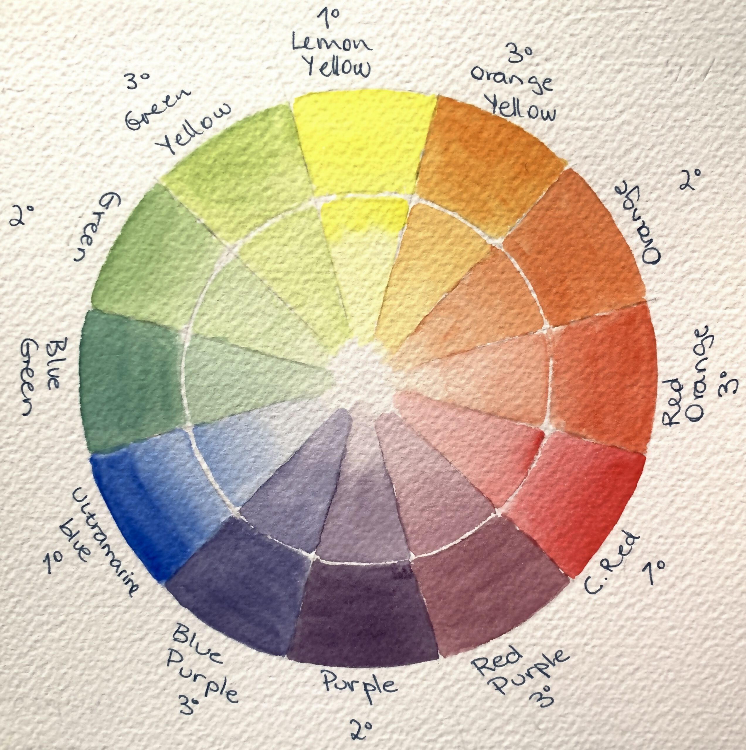
The foundation of color theory lies in the primary colors: red, yellow, and blue, though in watercolor, some artists use a magenta, cyan, and yellow palette to expand mixing options.
When two primary colors are combined, they create secondary colors:
– Red + Blue = Purple
-Blue + Yellow = Green
– Yellow + Red = Orange
Further combinations produce tertiary colors, such as red-orange or blue-green. As you explore, your palette will naturally expand.
2. Building Your Own Color Wheel
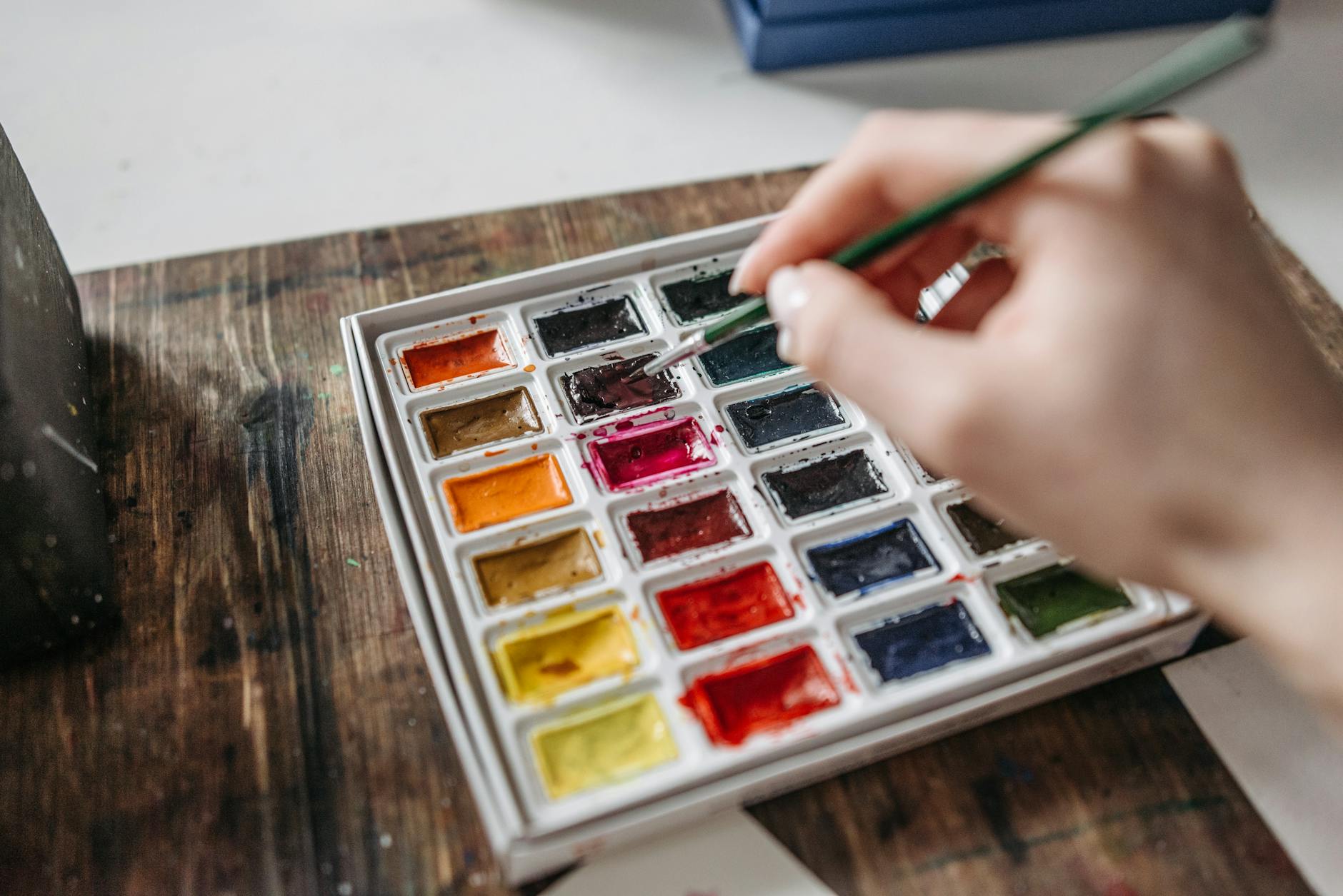
Painting a color wheel is an effective way to gain familiarity with watercolor. This exercise demonstrates how colors interact on paper, and how adding water can alter a color’s value and create countless variations.
In my class, we create a color wheel together, providing an opportunity to practice mixing colors and understanding their relationships.

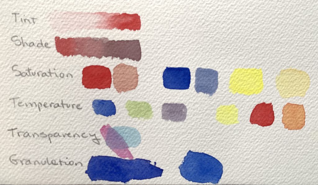
3. Color Properties: Hue, Value, and Saturation
To control color in watercolor, it’s important to grasp the concepts of **hue, value, and saturation**:
Hue refers to the color itself (e.g., red, blue, green).
Value is the lightness or darkness of a color. In watercolor, this is easily adjusted by adding water, with diluted colors appearing lighter.
Saturation measures a color’s intensity. A highly saturated color is vibrant, while a desaturated one is more muted.

During the course, we will explore these properties further, particularly through value scales, which reveal the range of shades achievable from a single color.
4. Warm vs. Cool Colors: Creating Mood with Color
Another key aspect of color theory involves understanding warm and cool colors. Warm colors (reds, oranges, yellows) often evoke energy and warmth, while cool colors (blues, greens, purples) suggest calmness and space.
The mood of your painting can shift significantly based on your choice of warm or cool colors.
5. Practical Exercises for Your Watercolor Journey
Hands-on practice is an integral part of learning watercolor. Throughout the course, you’ll work on exercises designed to solidify your understanding of color theory, such as:
– Mixing primary colors to create your palette
-Creating a color wheel with your chosen primary colors
– Warm vs. cool colours and their effects on a painting
– You will learn how to mix colors to create vibrant new colours and avoid dull and flat mixes.
These exercises help build your confidence in working with color, even if you’re new to watercolor.
Ready to Dive Deeper?
If you’re ready to explore watercolor in greater depth, consider joining my Introductory Watercolor Course at My Modern Met Academy. This course will guide you through applying color theory and other fundamental techniques, with step-by-step projects designed to help you build a strong foundation in watercolor painting.
You’ll be creating two projects, a Landscape and a Still life. That way you’ll be putting to practice all that you’ve learned!
Mastering color theory is not just about learning to mix colors, but also about discovering your own artistic voice and style. By developing these skills, you will be able to create more expressive and cohesive works with watercolor.
